Basic Chart Settings
In our last lecture, we introduced the four basic principles of market behavior in all liquid markets and timeframes. These rules form the foundation of all successful technical trading strategies, so it is worth your time to read and re-read those rules, and then to think about how you might apply them to actual trades. In these next two lectures, we will do three things: First, we will talk about the nuts and bolts of setting up your charts. There are many choices in styles, indicators, averages and timeframes, and even if you already have a favorite setup, we would encourage you to embrace our ideals of simplicity and minimalism. Next, we will begin to lay the foundation for old school, classical chart reading. Take this opportunity, regardless of your previous experience, to start over with a beginner’s mind and build a good foundation from solid building blocks.
When it comes to setting up your charts, follow two rules: keep it simple and be consistent. Many people slap every possible indicator, moving average, and color rule on their charts, using the justification that if you have to make a decision, don’t you want every possible piece of information to factor into that decision? The answer is no, you don’t. Too much conflicting information leads to paralysis by analysis. Strive for minimalism. It is far better to have fewer inputs that have a verifiable edge than it is to have 20 indicators that might all be worthless.
As you talk to other traders, you will hear that such and such is helpful sometimes. Be careful with this logic. Imagine you flip a coin every time you have a trading decision to make—heads you stay in the trade, tails you get out immediately. If you do this enough times, you will have some great stories to tell about the times that the coin really saved you from a bad trade or helped you stay with a trade you might have exited early. The question is not, “is this tool ever helpful?” The correct question is, “if I use this tool on a set of one thousand trades will it, on average, help me make money?” The sad fact is that most of the technical tools in common use today are pretty much worthless. It is far more valuable to learn to read price action and to understand the intent behind the emerging market structure than to know some cool trade based on moving average crossovers confirmed with stochastics.
In setting up your charts, the first question you will need to consider is whether to use bar charts or candlesticks. Simple bar charts use price bars that show the high and low of the time period’s trading range, with a tick on the right to show the “closing” price of the period, and an optional tick on the left to show where the period opened. Be very careful with intraday bar closing values, as they are more or less meaningless. On a daily chart, the close does have some significance (though this could change as markets move more and more toward 24 hour trading), but intraday closes are little more than random price samples. It is very possible to see completely different closes on intraday bars between charting systems that might use slightly different clock settings. Be very suspicious of any trading system that depends on where an intraday bar “closes”.
Candlesticks have many patterns with very cool names, but the only problem is that those patterns don’t actually have any predictive value . An entire industry has grown up around teaching candlestick patterns through books, seminars, videos and specialized software, but we would encourage you not to focus too much attention on these patterns.
For some traders, candlesticks may also be more sensitive to the issue of intraday opens and closes than bar charts because the visual candle patterns emphasize these relationships. It is not that intraday opens and closes are meaningless, but they probably are less meaningful than most people think. Focusing on them, and on patterns based on them, introduces an arbitrary semi-random element into your trading. This is at least worth some careful thought and consideration.
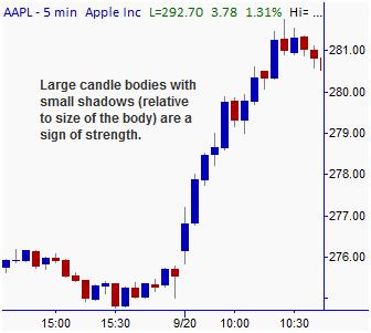
If you are going to use candlesticks, there are a few advantages and a few cautions to keep in mind. The primary advantage of candles is that they speak to some traders a little more quickly and show them the relative balance of buyers and sellers. With candles, some signs of strength are:
- Large ranges. (Very large ranges can indicate exhaustion and end of trend.)
- Large bodies relative to shadows.
- Very short, or no shadows.
- Multiple large bars in the same direction.
All of these patterns can also be seen on bar charts, but they are a little easier to see on candles. One of the dangers of candlesticks (compared to bar charts) is that candlesticks visually emphasize the bodies and trivialize the shadows. You may be tempted to ignore shadows or draw trend lines touching only the bodies of candles. This is rarely a good practice (and something most traders would never do with bar charts), so be careful. Another disadvantage is that candles take up much more space on the screen than bars do. This might seem silly, but in some cases it may be important to fit more information on the screen.
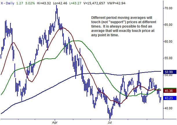
It is important to avoid cluttering your charts with useless lines and indicators, but many traders find that having a moving average or two can be very helpful. If you do choose to use a moving average, be very clear about what you expect from this tool. Some traders will talk about moving averages providing support or about trades that trigger around moving averages. In our opinion, this is misguided. A moving average pattern is more or less arbitrary because the pattern depends on the time period of the average. For instance, if a 55 day moving average is showing support, then price probably has not touched the 60 day, while it has already traded through the 50 day. What is magic about the 55 day? At any point on any chart, you can always find a moving average that is supporting price by adjusting the period of the moving average, but this is meaningless. Be very careful of attributing too much power to moving averages (and this includes commonly watched ones such as the 50 and 200 day on daily charts.) 
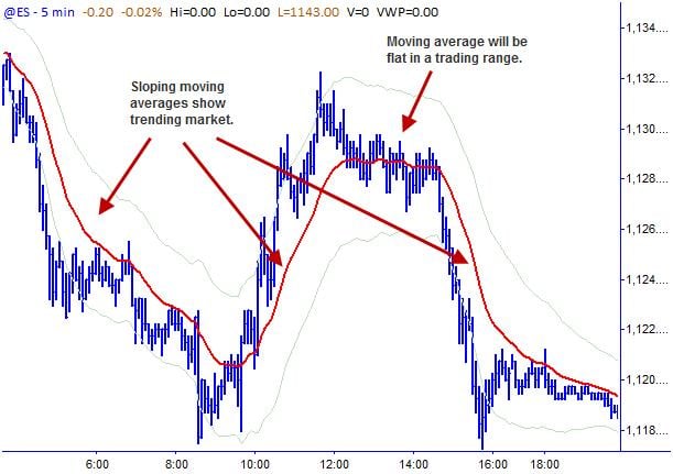
So, why have moving averages at all? Three reasons: they can help quantify the direction of a trend, they can show points of potential climax/exhaustion, and they can also indicate points where buyers and sellers are in balance. We will study these patterns in more depth in a future lecture, but one of the simplest indications of trend is the slope of a moving average. If you consistently find yourself trading against the slope of the moving average, then you are probably focusing on countertrend trades, which is a difficult way to start a trading career. (The position of a shorter-period moving average relative to a longer-period moving average is another common way to quantify trend.)
Also, the distance a market pulls away from a moving average gives some indication of the market’s strength and can indicate potential points of exhaustion. Say a stock is showing a pattern of pulling away from the moving average by about $0.25 and then making buyable pullbacks. If this same stock then has a very strong move that pulls it $0.75 away from the moving average, this can indicate that the market is now overextended. If you do not understand the patterns around climax and exhaustion points, you will find yourself frustrated as many of your trades immediately and dramatically reverse agains you. Many losing pullback trades come after such exhaustion points, which can be difficult to see without some reference to an average price.
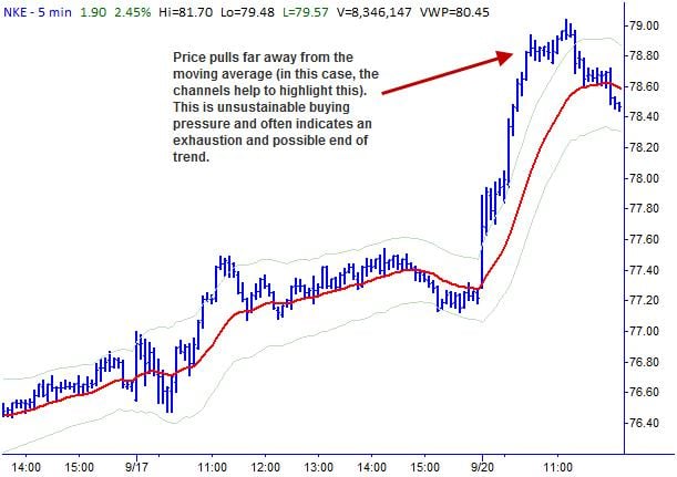
To make finding these exhaustion points even easier, it can be helpful to have some kind of bands or price channels set around the moving average to define points where the market may be overextended. Some traders use bands set a fixed percentage of price above and below the moving average, but the best technical tools adapt to the changing volatility conditions in the market. Bollinger bands are one common solution, but there are some serious conceptual flaws in this tool. Keltner channels, which draw bands based on a multiple of the average true range above and below a moving average, may be a better choice for many traders.
Lastly, there are many different kinds of moving averages available in most software packages: simple, exponential, triangular, weighted, adaptive, composite and offset are just a few. In practice, these will all show similar behavior on charts, so there really is not much difference. Simple moving averages do have the minor issue of the “observation window effect”. Imagine a very quiet market that suddenly has a large price movement, and then goes quiet again at the new price. A short to intermediate term moving average will show a large jump on the event day, and then another jump at a later date when the event passes out of the window, even though price did not move. This is more of a theoretical problem than an actual issue in most cases, but exponential averages solve this problem by using a calculation that fades past data points rather than cleanly dropping them off. Our advice is pick a moving average and stick with it, as there really is no clear advantage to any specific tool.
All of these definitions are somewhat arbitrary because they will depend on the period of moving average you choose. For instance, a 5 period moving average could well be in a downtrend, while a 20 period is sideways and a 50 period is in a clear uptrend. The most important thing with your chart setups is that you are consistent. The indicators you choose to use structure the data a certain way and you are training your eye to see patterns in the data. If you are always changing indicators or inputs, then that learning process will not take place. You should also use the same indicators regardless of the timeframe of the chart. Do not switch inputs or indicators between 1 minute, 5 minute, daily or even monthly bars. Keep it simple, keep your charts clean, and be consistent in everything you do.
One other subject to consider is the possibility of using oscillators or other indicators on your charts. There are many options ranging from stochastics to MACD to CCI to RSI, and many other more “advanced” tools. Add to that a wide range of inputs and you have literally tens of millions of ways to set up a single chart. For most new traders in most situations, these oscillators and indicators probably do more harm than good. First, they are all calculated off of price so they all lag market movements. Without exception, every one of the commonly used technical tools is a lagging indicator. There are no simple, reliable trade setups or patterns in any indicator which will lead to profitable trading. Furthermore, focusing on the patterns in these indicators will tend to remove your focus from the most important technical factor, which is how the patterns on the charts illustrate the emerging supply/demand story in the market.
One last word of advice is in order before we leave this topic. No matter what tools, lines, indicators or whatever you choose to add to your charts, it is important that you are completely consistent. As you study charts, you are training your eye to see the data in a certain way. One minute, 60 minute, daily, monthly charts should all have basically the same settings and indicators, and do not make changes until you are completely comfortable with what you are already using. It is a mistake to bounce around from one week to the next from RSI to CCI to stochastics, changing settings and inputs all the time. Learn the behavior of whatever tools you choose to use in all market conditions, and then they will be truly useful for you. It is simply not possible to do that until you have logged many weeks or months with the same set of tools and seen many thousands of patterns on those same tools. Real competence probably cannot be achieved until you have used them through at least one complete bull-bear market cycle with the accompanying changes in volatility regimes, which will usually require 5 – 10 years of continuous trading. There is no substitute for experience, but you are laying the foundation for a lifetime of learning over these next few months of concentrated study.
1. To put it more properly, when tested objectively over a very large sample size, the returns following common candlestick patterns are indistinguishable from the baseline returns in the stock/index/futures contract/currency.)
2. If you want concrete recommendations, we have found Keltner Channels set 2.25 ATR’s above and below a 20 period moving average to be a good place to start.
No comments:
Post a Comment